Year One / Semester One - Graphic Design I at SAA
A compilation of projects done at SAA! :)
This first project is a simple Advertisement. It's the first Ad I've ever made. We were told to choose a product and then our teacher would give us an unrelated word and we'd have to tie it in. My product was eyeliner and my word was 'gifted'. I did a lot of research and had lots of thumbnails/brainstorm sessions before deciding to go in the route of a 'gifted student'. That hit home to me because in elementary school I was always in the gifted programs.
This ad was made entirely in Photoshop.

Our second project in this class was to make a redesign of a logo. I chose Square One Salon, which has a really terrible logo. I won't put it here since I didn't make it, but you'll have to believe me. This isn't my first time making a logo, so I knew what I wanted to do. I put a hard focus onto the colours as well, since I really love colour theory.
The pink colour represents giving and receiving of nurturing. The seafoam is meant to bring out feelings of health, relaxation, and rest.
I made the woman have a face with a squared jawline as well, which isn't a crucial design element but more of a fun pun.

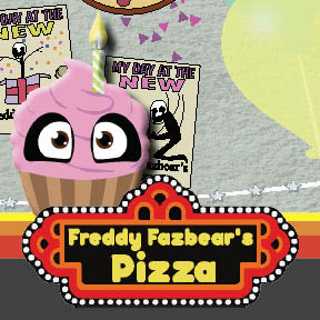
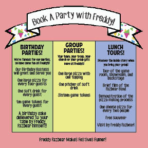
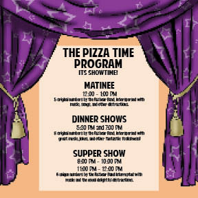
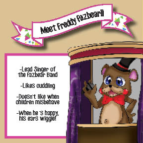
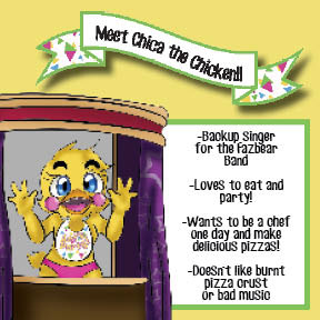
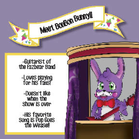
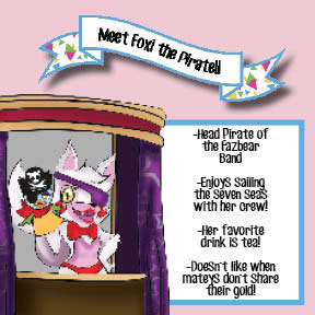
The following is a brochure we had to make for a business. I chose the fictional business of 'Freddy Fazbear's Pizza' from the popular horror game, Five Nights at Freddy's. I had to create the elements all on my own (mostly with illustrator) and then laid them all out in indesign. I also printed and put together the brochure, but I think my teacher kept it?
Looking back on this, other than the front and back covers, I feel like this was a lack luster project.
"Why include it?" You ask. Simply because it was part of my expierence at school. I learned a lot from this project and I think I may even go back and redo it one day. I also think it's important for other designers & artists to know that not every piece you make will be perfect. :)